Southern Comfort
- Brand Identity
- Packaging
- Portfolio Architecture
A brand rediscovers its roots
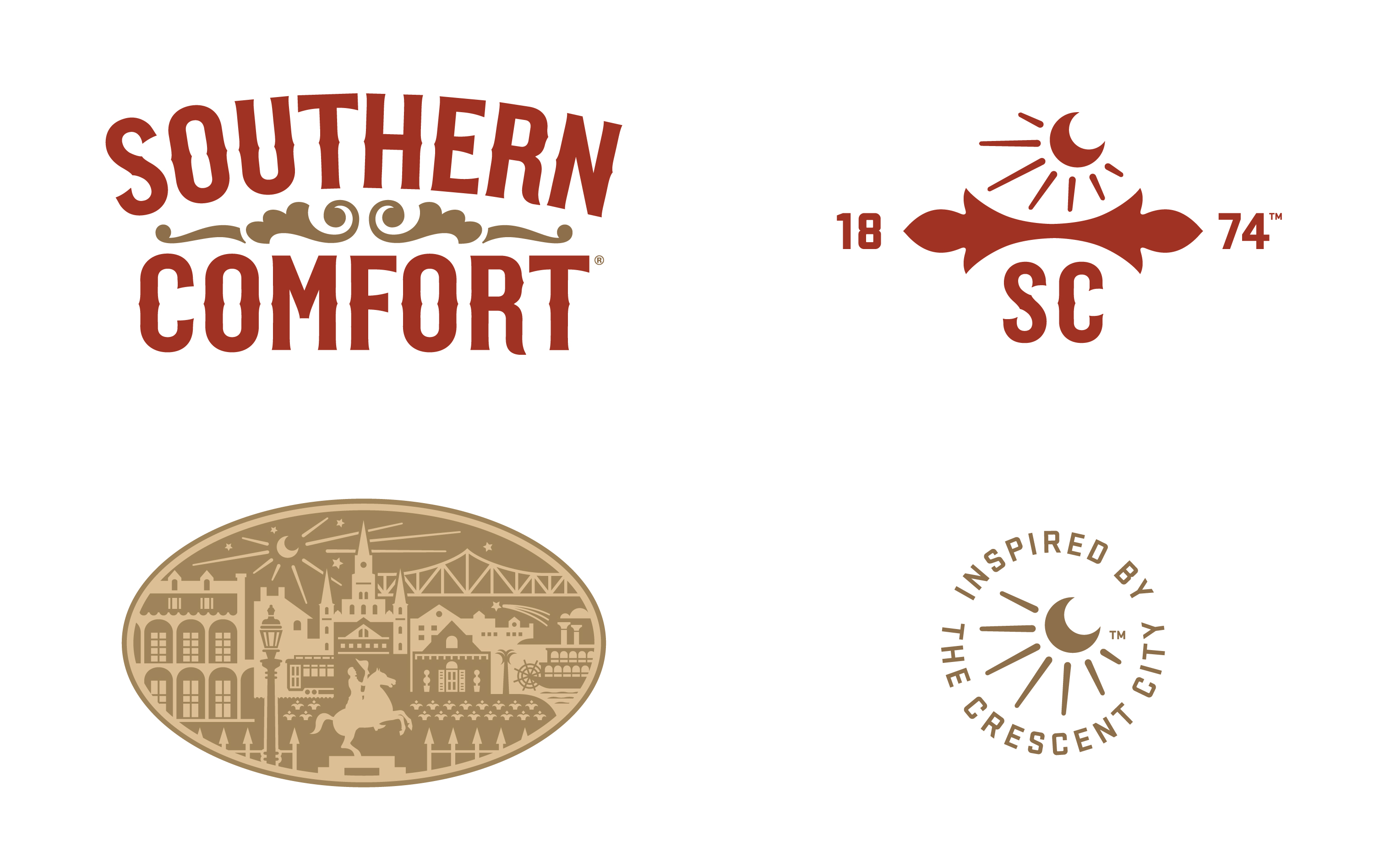
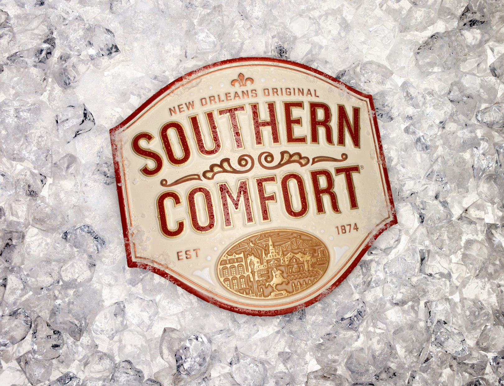
Southern Comfort had authentic roots, history, and strong name recognition, but the brand had lost its relevance. A trip to the heart of New Orleans revealed that the soul of the brand could still be found. There, we discovered a story that, like the product itself, was genuine, intriguing and inviting.
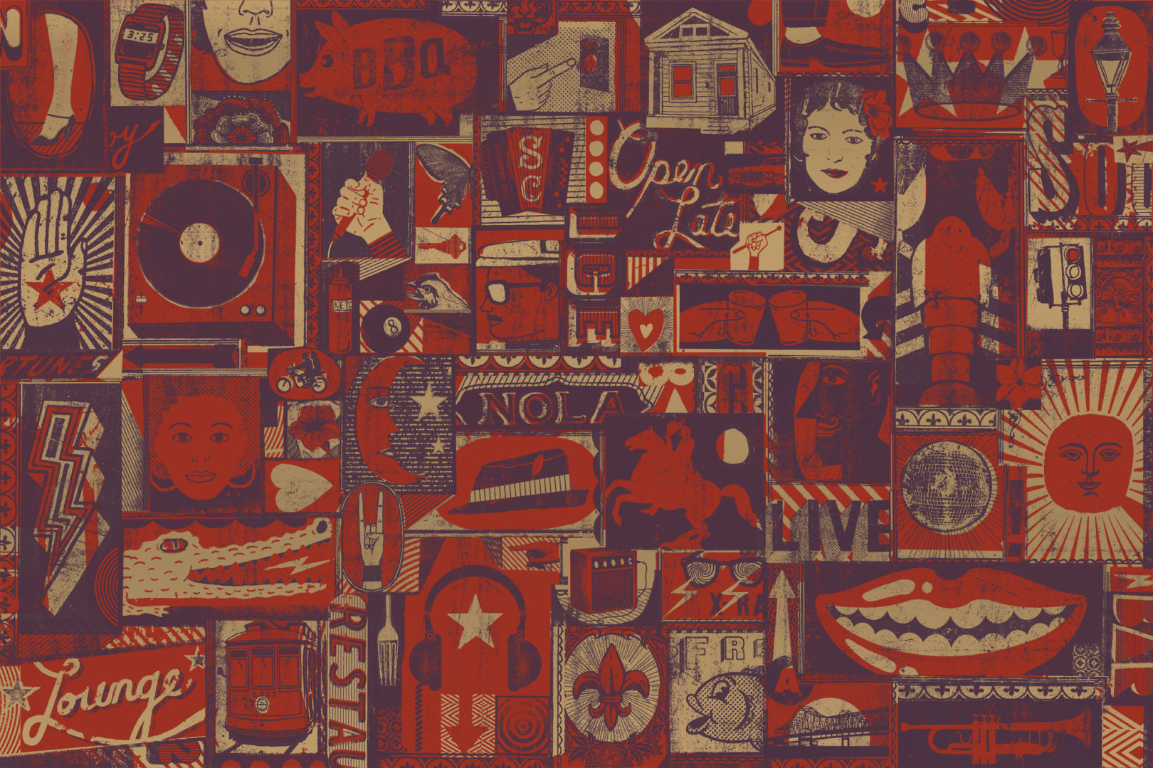
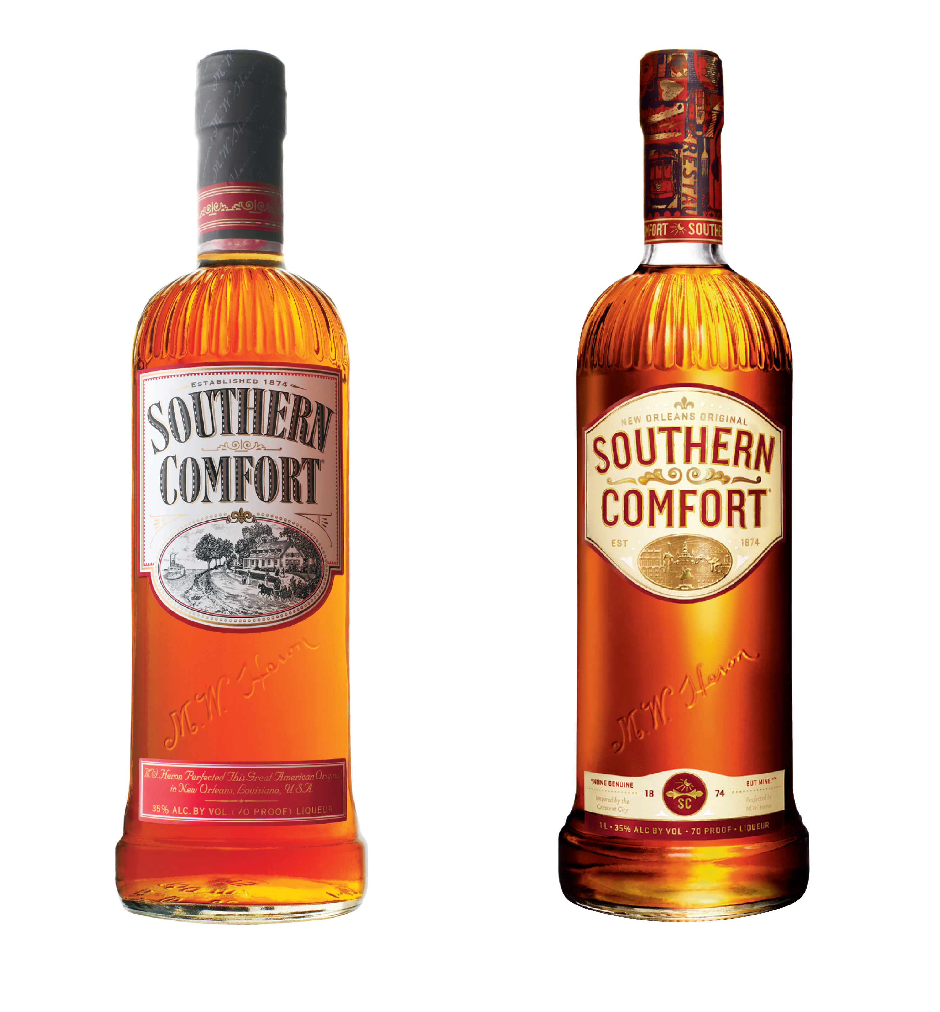
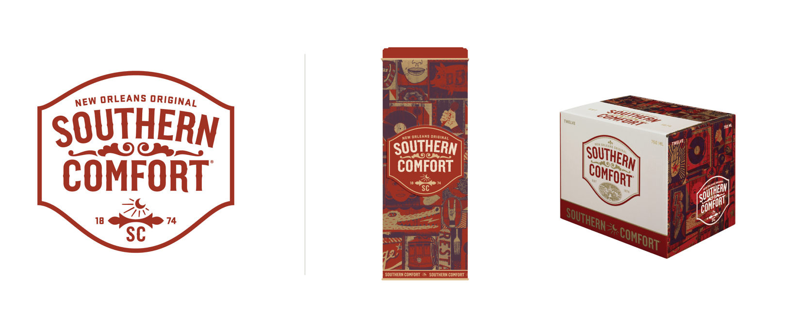
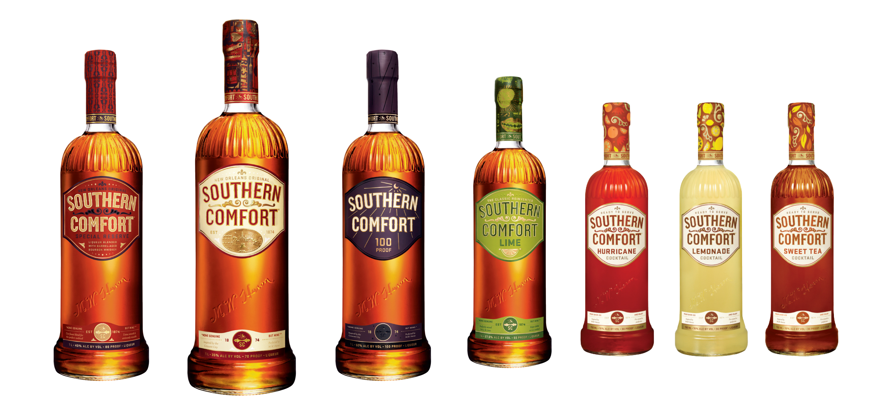
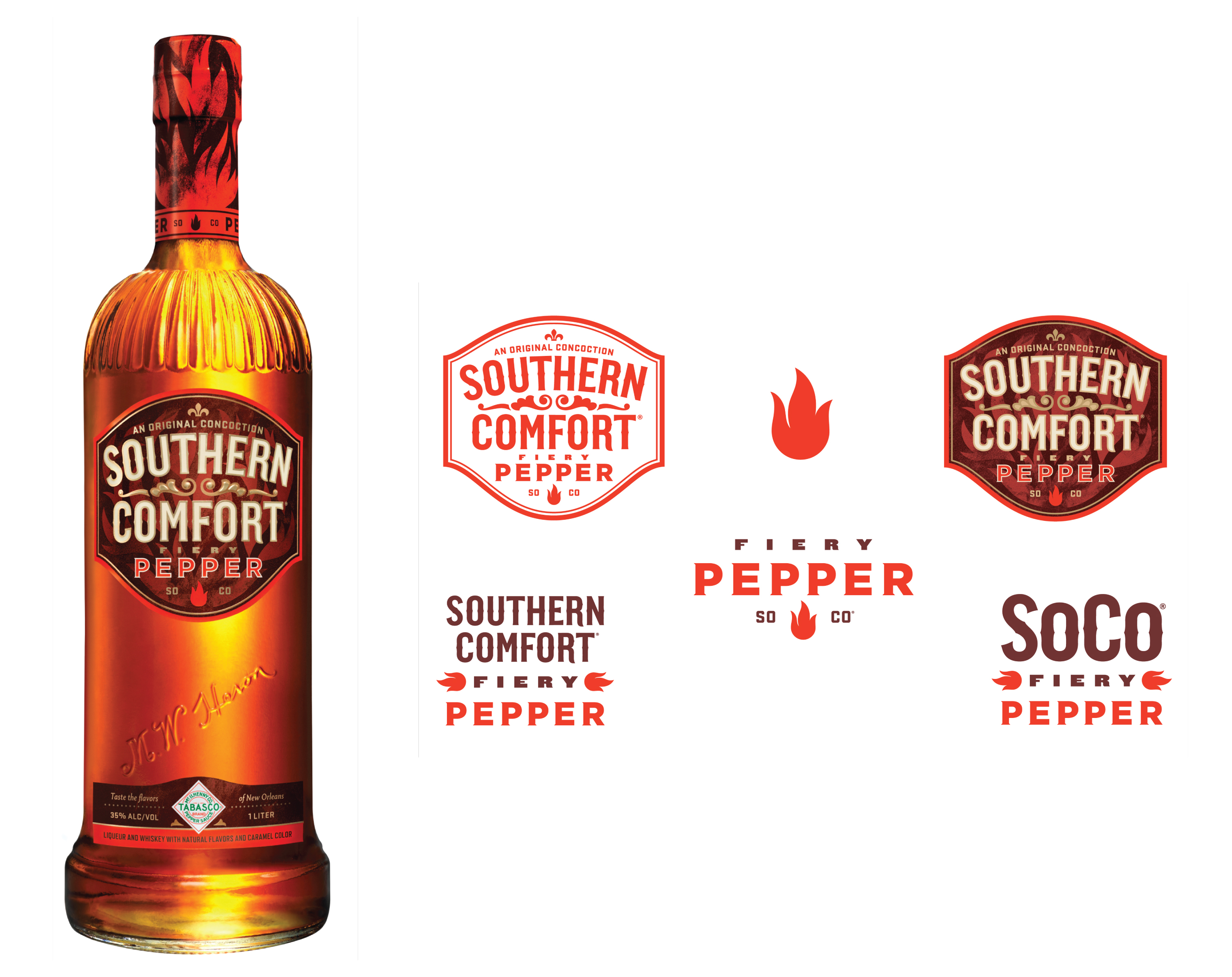
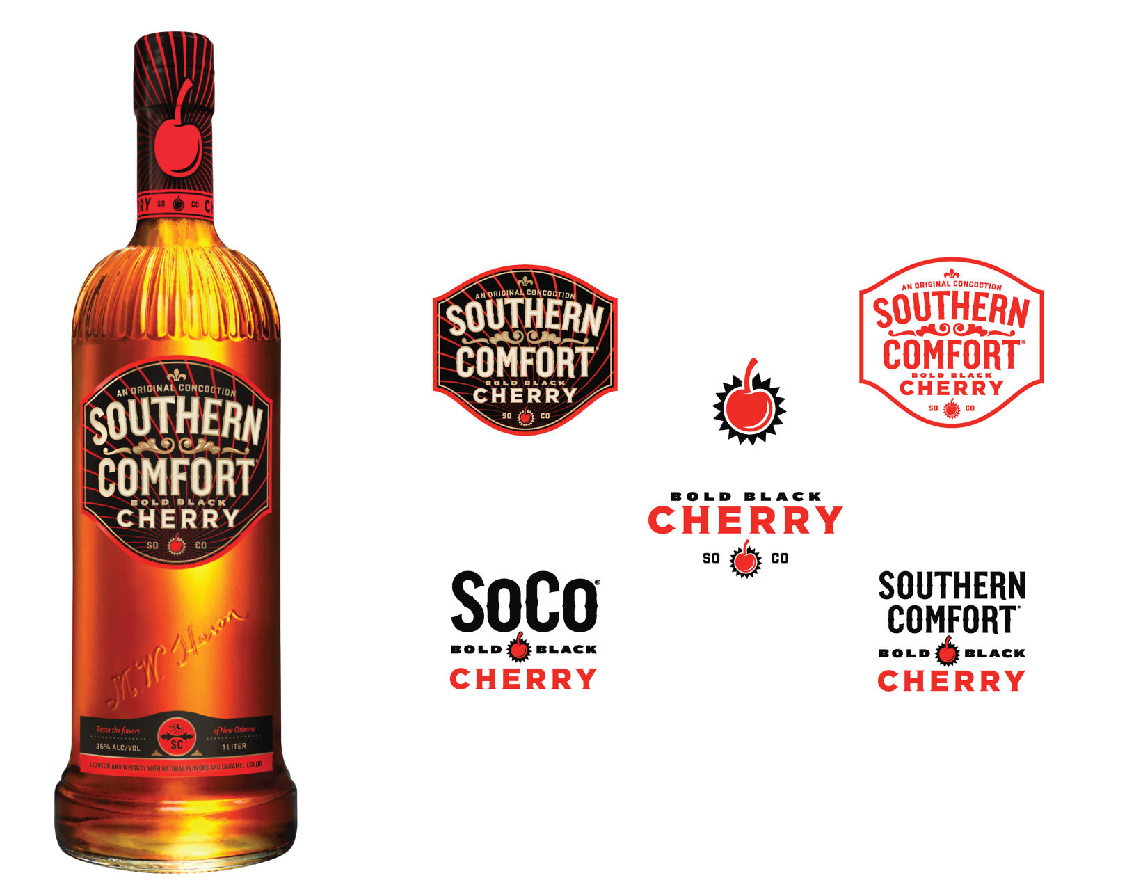
We retained equities of the old brand, but refined and added new elements to reinforce the brand’s heritage. Bespoke elements were used to activate the band, including a new label to complement the bottle’s unique characteristics, and illustration applied to the bottle’s neck to add personality. Visual language extended the brand to on-premise promotions, point of sale, and other points of consumer touchpoints.